Visualising geospatial data
Geographic information systems, or, as we in the trade refer to them, “maps”
July 4, 2016 — February 2, 2022
The particular pitfalls of data visualisation for geographic mapping. Cartography, with data.
1 General theory
- John Krygier Perceptual Scaling of Map Symbols
- NYT’s Matthew Ericsson
- Beyond mapping
- Tilegrams.
- Vizumap: Visualizing uncertainty in spatial data (Lucchesi, Kuhnert, and Wikle 2021)
- ColorBrewer: Color Advice for Maps generates color schemes for geospatial purposes.
2 GIS systems
Geographic Information systems are the spreadsheets of map data.
ESRI ArcGIS is the classic commercial geographic information system. QGIS project! is the flagship open source alternative. Its interesting feature is that is supports python scripting.
Much lighter, NASA GISS: Panoply 3 is a simple viewer for certain popular scientific data formats, netCDF, HDF and GRIB Data.
3 Browser-based
There are a variety of map systems to visualize geospatial data in the browsers, i.e. do maps you can click on.
A simple way to get started here is to encode data in GeoJSON standard. (Maybe see a more casual introduction if you are interested in that.) Ifter the standard of such things there is also a slightly more refined standard called TopoJSON which has less market share.
Various providers give us map tiles (i.e. what we would call the map itself, showing coastlines and train tracks and forests etc): OpenStreetMap, Mapbox, Stamen or Thunderforest or Felt: Felt.
These tiles are used as an underlay by the various geospatial data vis libraries. I’m explaining this badly, but I think if you just give it a try you will acquire intuitions reasonably fast.
3.1 Leaflet.js
Leaflet is the leading open-source JavaScript library for mobile-friendly interactive maps. Weighing just about 39 KB of JS, it has all the mapping features most developers ever need.
Leaflet is designed with simplicity, performance and usability in mind. It works efficiently across all major desktop and mobile platforms, can be extended with lots of plugins, has a beautiful, easy to use and well-documented API and a simple, readable source code that is a joy to contribute to.
Leaflet uses the OpenStreetMaps mapping system per default. It is lacking some of the integrations that Google Maps has, but also some of the horrible spyware.
3.2 Google maps
A classic browser interactive mapping provider. The usual caveats about google apply. For our purposes the important thing is that we can create a Data layer which plots for quantitative data visualisation, and this data layer can come from other languages such as Python and R.
3.3 Plotly
Plotly is not a mapping library but it will plot maps happily as part of other plots.
e.g. Kerry Halupka notes How to create maps in Plotly with non-US locations.
4 Python
I am not sure about the options here, but probably GeoJSON export and javascript visualisation is useful. For example, create your geographic visualisations using python + leaflet.js, then generate javascript maps using a standard browser map.
Possibly useful: folium.
5 R
See spatial data in R.
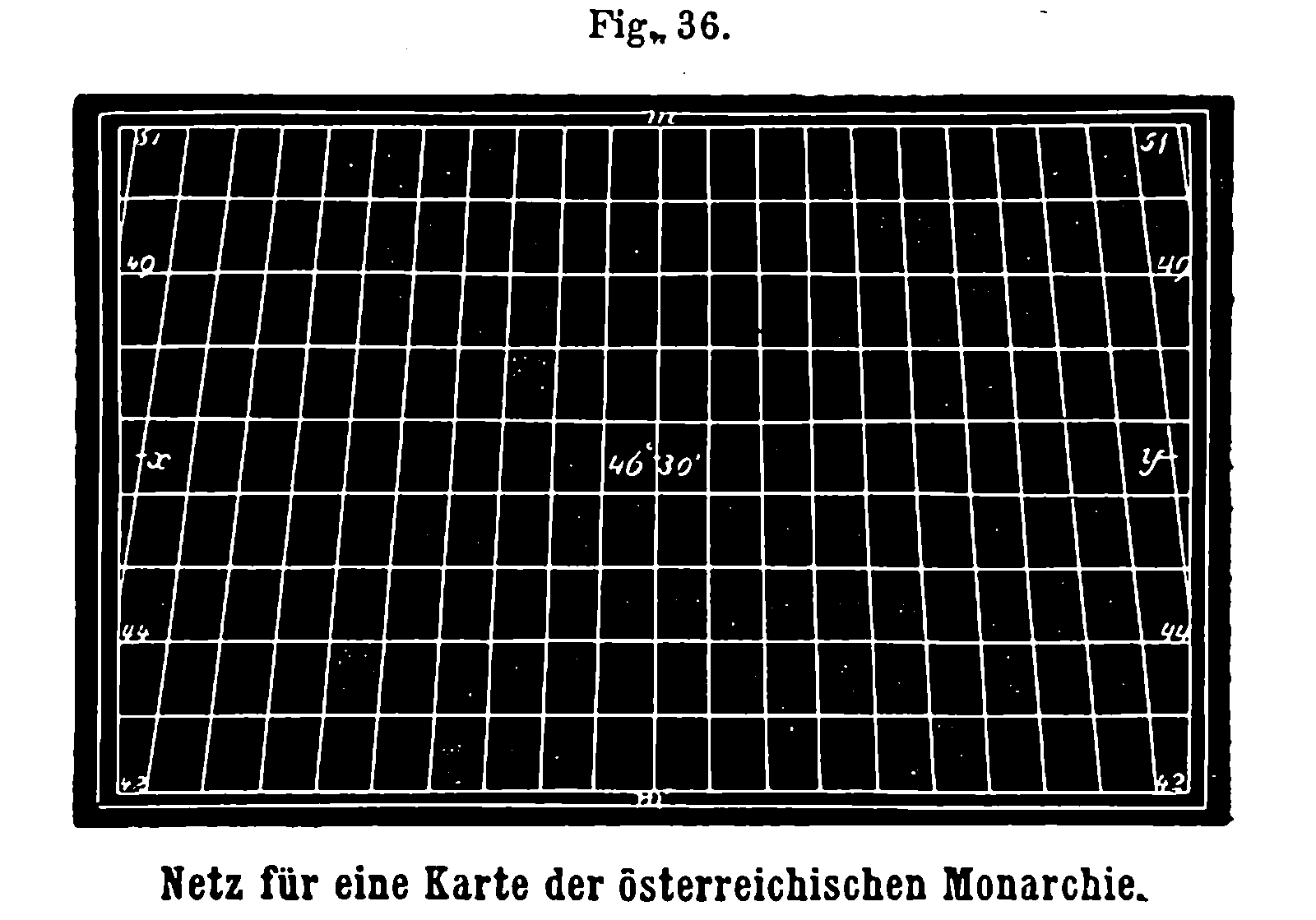
6 Historical maps
Aside: I am obsessed with sea monsters on old maps.
- Olaus Magnus’s Carta Marina of Scandiavia is on Wikimedia Commons although the Alvin copy is better
- The Enchanting Sea Monsters on Medieval Maps
- Imaginary Maps in Literature and Beyond: Map Monsters
7 Mapping non-geospatial things
Using maps as visualisations of non geospatial things is a whole other field. What if you can leverage spatial intuition by pretending something is spatial? e.g., as mentioned at knowledge topology, Franka Miriam Brückler’s famous map of Middle Math.
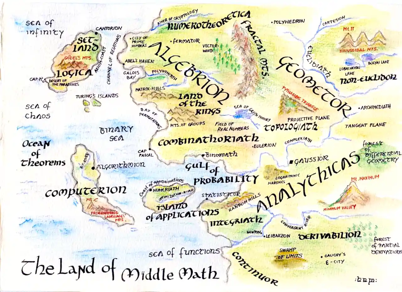
That sounds fun and I’m sure it is studied elsewhere.
cf the Map of Reddit.